Typography on the Web Is an Engineering Problem
Fluid type, variable fonts, and why the measure beats the ratio
Type on the web is not a styling choice. It is an engineering problem with real constraints: bytes on the wire, layout shift you can measure, and text that has to stay readable from a 320 pixel phone to a 1440 pixel monitor. Treat it as decoration and it breaks the moment real content hits it. Treat it as a system and it holds.
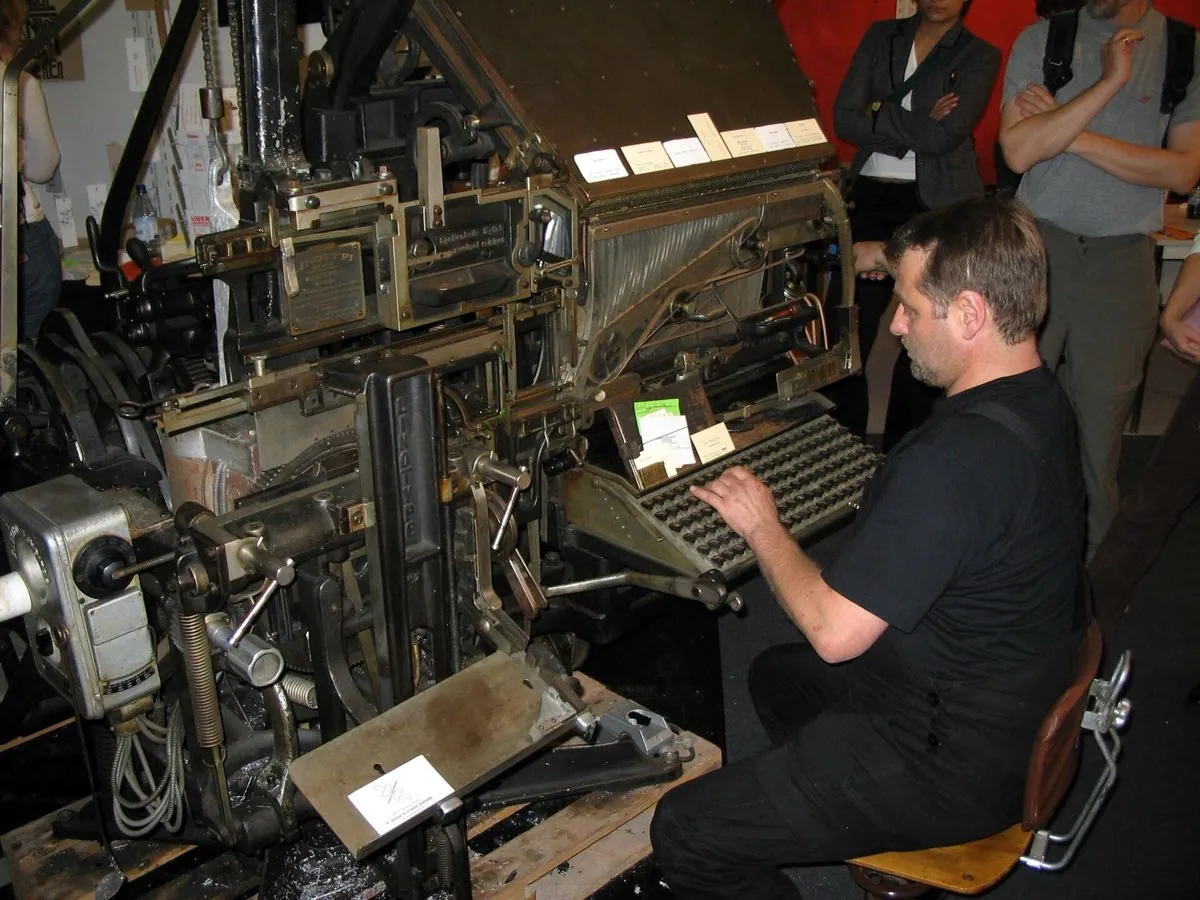
I spent years picking type scales the way most people do. I chose a ratio, multiplied my base size by it a few times, and pasted the results into a stylesheet. It looked tidy in the design file. Then someone opened the page on a laptop, or pasted in a heading twice as long as my placeholder, and the tidy system fell apart. The problem was never the ratio. It was that I had designed for one width and shipped to thousands.
Breakpoints were always a guess
The old way to size type was to pick a few screen widths and set a fixed size at each one. Small phones get 16 pixels, tablets get 18, desktops get 20. Between those points, nothing changes, so text sits at one size across a huge range of widths and then jumps. You have seen the jump. Drag a browser window slowly wider and the heading suddenly leaps up a step. That leap is the interface admitting it only planned for three or four specific screens.
- Fixed size between each breakpoint
- Text jumps at 768px, 1024px, and so on
- You maintain the same scale three or four times
- Sizes are right at the breakpoint, wrong between
- New device widths need new rules
- Size grows smoothly with the viewport
- No jumps anywhere along the range
- One rule covers every width at once
- You set the floor, the ceiling, and the slope
- New widths just fall on the same line
Fluid type replaces the steps with a straight line. You draw a line between two points, a minimum size at a small width and a maximum size at a large width, and the browser reads off the size for whatever width it actually gets. CSS has a single function for this. clamp() takes a floor, a preferred value that scales with the viewport, and a ceiling. The preferred value mixes a fixed part with a part that grows as the screen grows, which is just the equation of a line written in CSS.
h1 {
  /* min, then a line: fixed part + slope * viewport, then max */
  font-size: clamp(1.75rem, 1.1rem + 3.2vw, 3rem);
}The tools that generate these values, Utopia being the clearest, do exactly this. You give them two screen widths and two font sizes, and they solve for the line. There is no magic in it. It is the same maths a printer used when scaling a poster: pick the size at two ends and interpolate the middle. The web just makes the interpolation happen live, on a device you will never see.
The perfect ratio is mostly folklore
Here is where I go against common advice. The type world loves modular scales: pick a ratio like 1.25, the major third, or 1.618, the golden ratio, and every size is the one below times that number. It sounds principled. It borrows the authority of music and nature. In practice it falls apart, and it falls apart for a reason nobody mentions in the tutorials.
A fixed ratio compounds. Multiply by 1.618 a few times and the gaps between sizes explode. On a narrow phone, a golden ratio scale puts your body text at a sensible 17 pixels and your top heading at something absurd that no longer fits the line. So designers quietly break their own system: they use one ratio on desktop and a gentler one on mobile. At that point the ratio is not a rule. It is a decoration you override whenever it gets in the way.
| Step | Ratio 1.2 (minor third) | Ratio 1.5 | Ratio 1.618 (golden) |
|---|---|---|---|
| Body (base) | 16px | 16px | 16px |
| Step +1 | 19px | 24px | 26px |
| Step +2 | 23px | 36px | 42px |
| Step +3 | 28px | 54px | 68px |
| Step +4 | 33px | 81px | 110px |
The honest version is that ratios are a starting sketch, not a law. Pick a gentle one, generate the sizes, then hand tune every step against real headings and real body copy at real widths. The number that made the scale is the first thing you should be willing to abandon. What survives contact with content is not the ratio. It is the judgement you applied after it.
Variable fonts change the cost model
A variable font is one file that contains a whole range of a typeface instead of a single fixed style. Rather than shipping Regular, Medium, Semibold, and Bold as four separate files, you ship one file with a weight axis, and you ask for any point on it. The control for that is font-variation-settings, or the friendlier font-weight, which can now take any number, not just the round hundreds.
The cost story is not as simple as the marketing makes it. One variable file is bigger than one static weight. It is usually smaller than four static weights combined, and it gives you every weight in between for free. So the trade is real but conditional. If your interface genuinely uses four or more weights, the variable file wins on bytes and on flexibility. If you only ever use Regular and Bold, two static files can be the lighter choice.
There is a quieter feature hiding in good variable fonts: optical sizing. A real typeface, cut in metal, was drawn differently at 8 point than at 72 point. Small sizes got thicker strokes and more open shapes so they held together in ink. Optical sizing brings that back. With font-optical-sizing set to auto, the letterforms adjust to the size you render them at, so captions and display headings are not just the same shapes scaled up and down. It is the difference between a photocopy enlargement and a fresh drawing.
body {
  font-family: "VariableSans", system-ui, sans-serif;
  font-optical-sizing: auto;         /* redraw shapes per size */
}
.subtle-heading { font-weight: 560; } /* not just 500 or 600 */Line length is the decision that pays
If I could keep only one typography control, I would keep the measure. The measure is the number of characters on a line. It has the biggest effect on reading, and it is the decision most often left to chance. Set your body text in a container that runs the full width of a desktop and you get 140 characters a line. The reader's eye loses its place on the return sweep, the jump back to the start of the next line, and reading slows to a crawl.
Aim for an average line length of 45 to 90 characters, including spaces.
Notice that Butterick says 45 to 90, not the tidy 66 you see quoted everywhere. The famous 66 comes from Robert Bringhurst and it is a fine target for print. On the web there is no single right number, only a comfortable band, and the honest advice is a range. The practical fix is one line of CSS: cap your text container with a max-inline-size in the ch unit, where 1ch is roughly the width of a zero. Setting max-inline-size to 66ch pins the measure near the middle of the band no matter the screen. Butterick's own summary of most broken responsive layouts is that they simply ignore this.
The measure does not act alone. It works with line height, the space between lines, and the two have to move together. Longer lines need more line height so the eye can find the start of the next line on its return sweep. Short lines can take tighter spacing. Set a wide measure with tight line height and the text turns into a wall the eye slides off. This is why a single line-height value copied across every text size is another quiet failure. Body copy wants roughly 1.5, a large heading wants closer to 1.1, and the values in between are a judgement, not a constant.
Two newer properties help at the edges. text-wrap: balance evens out the lines of a short block like a heading so you do not get one lonely word on the last line. text-wrap: pretty targets the opposite problem in long body copy, discouraging those orphans without rebalancing the whole block. Both are in the CSS Text specification and shipping in current browsers. They are polish, not foundation. Get the measure right first, then reach for them.
Fonts you cannot see are a performance bug
A web font has to download before it can paint. That gap creates two classic failures. FOIT, a flash of invisible text, hides your words until the font arrives, so the reader stares at a blank space. FOUT, a flash of unstyled text, shows a fallback font first and then swaps, which is faster to read but can make the layout lurch when the two fonts differ in size. The control is font-display. The value swap chooses FOUT and keeps text readable immediately. The value optional lets the browser skip a slow font entirely on that visit, which protects the layout.
The swap is not free. When the fallback font and the web font have different widths, the text reflows on swap, and that reflow is counted against you as Cumulative Layout Shift, Google's measure of how much a page jumps around while loading. A janky font swap can push a page over the CLS threshold on its own. The fix is to match the fallback to the web font using size-adjust and the font metric overrides, so the swap changes the letterforms without moving anything. Preloading the font file with a link rel preload closes the gap further.
There is a cheaper win before any of that: send fewer bytes in the first place. Most web fonts ship every glyph the typeface has, including scripts and symbols your interface never uses. Subsetting strips the file down to the characters you actually render, and unicode-range lets you split a font into ranges the browser only downloads when a page uses them. For a mostly Latin product this alone can cut a font file by more than half. The fastest font to load is the one you never sent, so decide which weights and glyphs you truly need before you argue about swap versus optional.