Color That Survives Dark Mode, Low Vision, and Real Screens
Why hex lies, what OKLCH fixes, and how to build a ramp that holds
A color system has to work in three hard places at once: in dark mode, at low contrast, and for the one in twelve men who cannot tell your red from your green. The formats most of us reach for, hex and HSL, actively lie about how bright a color looks. OKLCH does not. Build on the honest format and the hard places get easier.
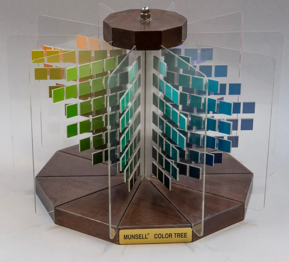
I used to build color ramps in HSL and wonder why they looked lumpy. I would set every step to the same lightness, say 50 percent, spin the hue around, and get a yellow that glowed and a blue that sank into the page. Same number, wildly different brightness. The tools were not broken. HSL was telling me a value that has almost nothing to do with what my eye actually sees.
Hex and HSL lie about brightness
HSL has three parts: hue, saturation, and lightness. The lightness number sounds like it should match how bright a color looks. It does not. A pure yellow at 50 percent lightness is dazzling. A pure blue at the same 50 percent looks nearly black. The human eye is far more sensitive to green and yellow than to blue, and HSL ignores that completely. So a ramp built on equal HSL lightness is uneven the moment you change hue.
Think of it like weighing fruit by counting pieces. Twelve grapes and twelve melons are both twelve, but nobody would call them the same weight. HSL counts pieces. It gives you a tidy number that does not track the thing you care about. For a single color you can eyeball your way past this. For a system of tints and shades across many hues, the error compounds until the whole set looks amateur.
- Every step set to L 50%
- Yellow glows, blue looks almost black
- Perceived brightness jumps between hues
- Ramps look uneven with no obvious fix
- The number does not match the eye
- Every step set to L 0.7
- Yellow and blue read at the same brightness
- Perceived brightness is actually constant
- Ramps step evenly by construction
- The number is built from vision research
OKLCH also has three parts: lightness, chroma, and hue. The difference is that its lightness is perceptual. It is built from a model of how people actually judge brightness, so equal L values look equally bright no matter the hue. Chroma is how vivid the color is, and it behaves independently of lightness, which HSL never managed. OKLCH landed in the CSS Color 4 specification and ships in every current browser, so this is production CSS, not a lab toy.
:root {
  --blue-100: oklch(0.95 0.03 250);
  --blue-300: oklch(0.80 0.09 250);
  --blue-500: oklch(0.62 0.16 250);
  --blue-700: oklch(0.48 0.13 250);
  --blue-900: oklch(0.35 0.08 250);
}Building a ramp with even steps
A color ramp is the set of tints and shades for one hue, from the palest tint to the darkest shade. The goal is even perceptual steps, so the jump from step 100 to 300 feels the same size as 300 to 500. In OKLCH you get this almost for free: hold the hue steady, move lightness in even amounts, and shape the chroma. Chroma needs shaping because the most vivid colors live in the middle of the lightness range. Very light and very dark colors cannot hold much chroma, so you ease it up toward the middle steps and back down at the ends.
The kitchen version: making a paint by mixing white into a base color. Each scoop of white should feel like the same step lighter. If you measure the white by volume it works. If you measure it by counting drops of different sizes, some steps jump and some barely move. OKLCH lightness is the honest volume measure. HSL lightness is the mismatched drops.
One more thing OKLCH gives you is a way to catch colors that cannot be shown. Every screen can only display so many colors, a boundary called the gamut, and it is easy to ask for a vivid color that falls outside it. In OKLCH the chroma value maps to how vivid a color is, so you can raise chroma step by step and see exactly where a hue runs out of room on the darkest and lightest steps. That is why real ramps ease chroma down at the two ends: not for taste, but because the vivid version simply does not exist there, and the browser would quietly clip it to something you did not choose.
Dark mode is not an inversion
Here is the mistake I see most: dark mode built by inverting the light theme. Flip white to black, swap the ramp end for end, ship it. It always looks harsh, and there are three reasons. First, a fully saturated color that looked calm on white screams on black, so you have to pull chroma down in the dark. Second, pure black backgrounds are wrong, which I will come back to. Third, the ramp itself has to be rebuilt, because the steps that gave good contrast on light do not line up on dark.
The real method is to design dark mode as its own theme with shared rules. Lift the darkest surface off pure black to a very dark gray, so about OKLCH lightness 0.18 rather than 0. Reduce chroma across the ramp, often by a third, so colors sit back instead of vibrating. Then re-pick which step of each ramp carries text, buttons, and borders, checking contrast against the new surfaces rather than assuming the light theme choices transfer. It is more work than an inversion. It is the difference between a theme that feels designed and one that feels flipped.
Contrast maths, and where it breaks
The legal standard for contrast is WCAG 2, and its core rule is a ratio. Normal body text needs a contrast ratio of at least 4.5 to 1 against its background to pass level AA. Large text needs 3 to 1. The stricter AAA level asks for 7 to 1. These numbers come from a formula based on relative luminance, and for most everyday color pairs the formula is a solid guide that keeps text readable.
- 3:13: 1AA for large text and UI components
- 4.5:14.5: 1AA for normal body text, the common target
- 7:17: 1AAA for normal text
- 21:121: 1Pure black on pure white, the ceiling
The WCAG 2 formula has known failure cases, and it is worth being honest about them. It handles light backgrounds better than dark ones, so some pairings that pass the maths look too faint on a dark surface, and some that fail look perfectly fine. It also treats a thin one pixel line and a block of body text the same, though they read very differently. This is not a secret. It is why a successor is being worked on.
| WCAG 2 contrast | APCA (WCAG 3 draft) | |
|---|---|---|
| Status | Current standard, legally cited | Draft, not yet a standard |
| Model | Ratio of relative luminance | Perceptual lightness difference |
| Handles dark mode | Poorly, known to misjudge | Designed to handle it |
| Accounts for text size and weight | Only two coarse buckets | Yes, built in |
| What to ship today | This one, it is the requirement | Test with it, do not rely on it |
APCA, short for Accessible Perceptual Contrast Algorithm, is the candidate replacement being explored for WCAG 3. It measures the perceived lightness difference between text and background, and it accounts for text size and weight, which WCAG 2 barely does. I test with it because it catches dark mode problems the old formula misses. I do not ship against it alone, because WCAG 3 is an early draft and could change. If you have a legal or contractual accessibility requirement today, it points at WCAG 2.2 AA, full stop.
Never let hue carry the meaning alone
Color blindness is common enough that it is never an edge case. Around one in twelve men and one in two hundred women see color differently, roughly 300 million people, about four and a half percent of everyone. The most common types blur exactly the reds and greens that interfaces love to use for error and success. So a status dot that is only red or green tells a large group of your users nothing at all.
The rule is simple and WCAG makes it explicit: color must never be the only way you carry information. Pair every color signal with a second channel. An error gets red plus an icon plus a text label. A required field gets a color plus an asterisk plus a note. A line chart gets color plus a distinct shape or a direct label on each line. Picture a hospital form that marks urgent cases only by a red tint on gray paper under fluorescent light. The color that seemed obvious on your monitor can vanish in the real setting. The second channel is what survives.