Problem
A dense gallery made every project compete equally and forced reviewers to assemble the career story themselves.
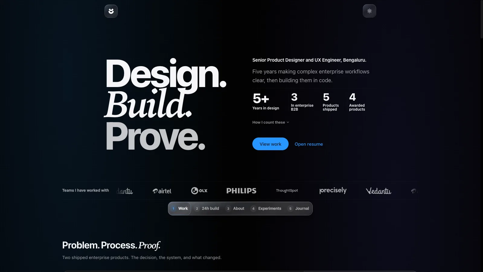
The current portfolio is a coded editorial system: two flagship stories, fast evidence discovery, a web-native resume, contextual previews, and release gates.
60-second brief · Portfolio product case
The problem was not a lack of evidence. It was making the strongest evidence easy to find without flattening the range and craft behind it.
The task looked like visual polish. Without hierarchy and release gates, polish would only make the clutter more persuasive.
A dense gallery made every project compete equally and forced reviewers to assemble the career story themselves.
Home became the fast hiring read, while case studies, a web resume, and contextual previews carry increasing depth.
The build checks decision records, accessibility tokens, asset weight, social cards, image descriptions, and rendered copy.
I own the information architecture, visual system, interaction model, React implementation, content, and release pipeline.
A long portfolio can contain strong evidence while still making a reviewer hunt for it. The current redesign makes flagship work, career range, ownership, and proof available at different depths instead of giving every artifact equal weight.
A dense project gallery made every item compete at the same level.
The homepage now behaves as a compact hiring decision surface.
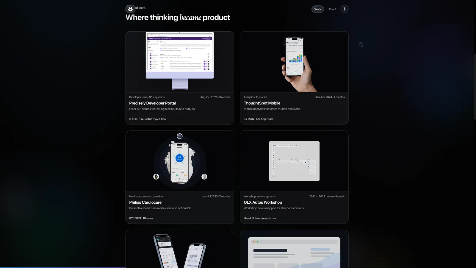
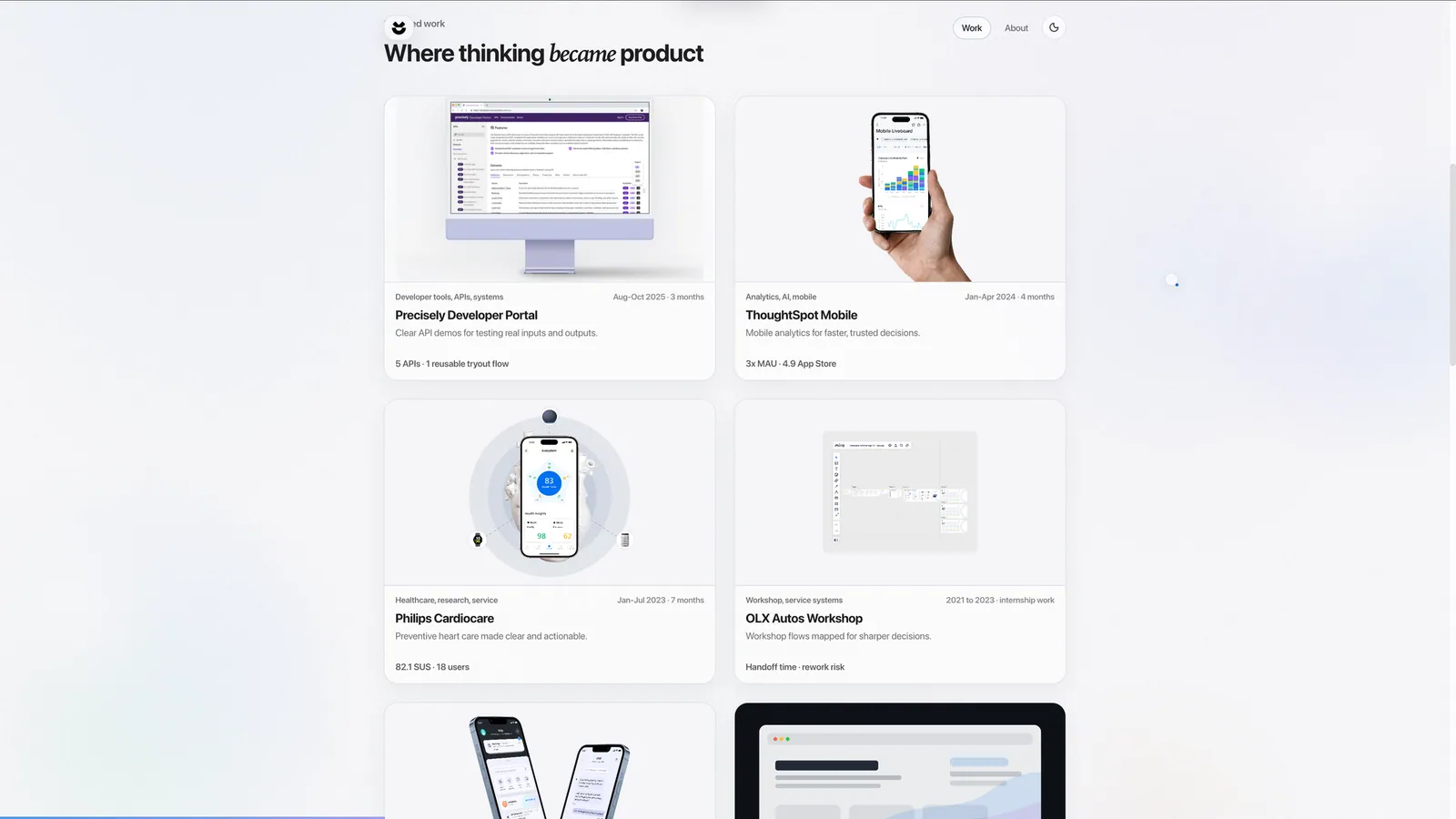
Home carries the fast hiring read. Large flagship projects lead into detailed case studies, supporting work stays compact, and hover previews reveal visual context without expanding the page. A separate web resume holds the complete chronology.
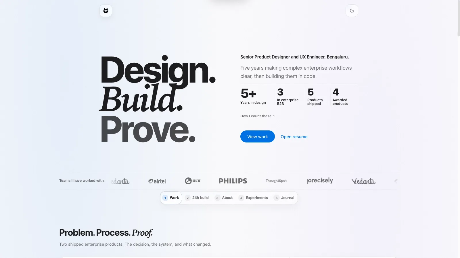
The site is implemented in React, TypeScript, Vite, Framer Motion, and Playwright. Shared navigation, pointer-following previews, theme-aware media, route metadata, and release checks keep project-specific pages inside one coherent system.
The pages a reviewer can enter and move between.
Project-specific evidence, decisions, and stated limits.
Reusable navigation, themes, media handling, and SEO.
Build steps that verify the shipped output.
The build report below is generated from the current build chain. Its gates check the production output instead of relying on a static description of process.
These checks exist because the current build report records failures that earlier releases allowed through.
Recomputes contrast for every color token pair in both themes against WCAG AA, and requires interactive text controls to be at least 24px tall. It caught four real contrast defects when it was introduced.
33 checks
Fails on any image over 600KB, any unconverted raster, and any source model left where it would be deployed. Added after the homepage was found shipping 8MB.
20.6MB of 21MB budget
Requires every route to ship its own social card, drawn from the site's own type and color tokens and held under 400KB. Added after every route was found sharing a single image, so a shared link never showed the page it pointed at.
41 routes covered
Fails on alt text that names a section and a counter, a filename, or a bare noun. Added after thirty two images shipped with descriptions like "Research overview 4", which passed the accessibility gate and still told a screen reader nothing.
28 images described
I own the portfolio's information architecture, visual design, interaction model, content system, React implementation, and release pipeline. This case documents the product and engineering decisions; it is not evidence of hiring conversion or recruiter behavior.
Automated checks can verify encoded rules, not whether a reviewer understood the work or whether every accessibility concern has been found. The next meaningful evidence would come from observed hiring-review sessions, not another implementation metric.
Generated on 2026-09-04 from the same build data used to describe the current release gates.
generate-journal-metadatatsc -bcheck-decisionsbuild-reportvite buildpostbuildprerendercheck-glasscheck-a11ycheck-weightcheck-ogcheck-altcheck-escapesRequires every published design decision to include considered options, positive and negative consequences, and a kill criterion. A decision cannot ship as a preference with the cost removed.
scripts/check-decisions.mjsConfirms every layered-glass rule survived the CSS build, so the depth treatment cannot be silently dropped by a refactor or an over-eager purge.
scripts/check-glass.mjsRecomputes contrast for every color token pair in both themes against WCAG AA, and requires interactive text controls to be at least 24px tall. It caught four real contrast defects when it was introduced.
scripts/check-a11y.mjsFails on any image over 600KB, any unconverted raster, and any source model left where it would be deployed. Added after the homepage was found shipping 8MB.
scripts/check-weight.mjsRequires every route to ship its own social card, drawn from the site's own type and color tokens and held under 400KB. Added after every route was found sharing a single image, so a shared link never showed the page it pointed at.
scripts/check-og.mjsFails on alt text that names a section and a counter, a filename, or a bare noun. Added after thirty two images shipped with descriptions like "Research overview 4", which passed the accessibility gate and still told a screen reader nothing.
scripts/check-alt.mjsFails on visible escape sequences and em dashes in source copy. Comments are ignored, so the gate checks what readers can actually encounter.
scripts/check-escapes.mjsGenerated on 2026-09-04 from 299 images totalling 20.6MB.